Color Me Castrated

You probably have never heard of it but, Color is a new photo sharing app for the iPhone. Although it might be fairly unknown, this app has already garnished a healthy 41 million dollars in venture capital from the fabled Valley firm: Sequoia Captial. To put that number into perspective, that is more than Sequoia gave Google in the early days. Let's start with what the haters are saying and move into something more positive.
Uncle Leo Laporte on his fabled TwiT radio show called Color a waste of money and an immediate failure. Robert Scoble picked up a few pieces but, in general was echoed out by a wonderfully large group of people on Leo's side. This sentiment seems to be transcending throughout the blogosphere, with very few positive voices squeaking through. Much of this mashing of teeth derives from these people seeing no real value in the product, certainly not the pro-ported 100+ million dollar evaluation.
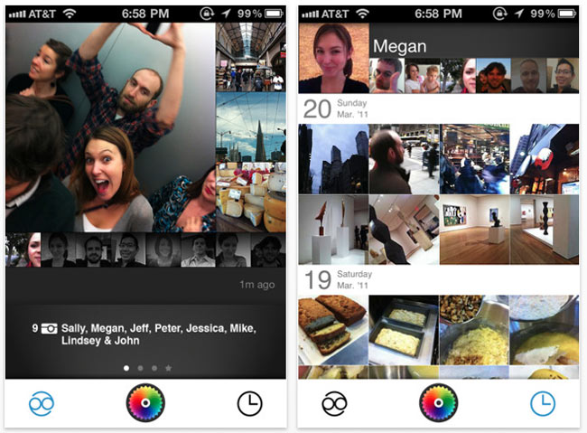
At its core, Color is just another photo sharing application that is currently stuck on the iOS platform. Its functionality might be reminiscent of Picplz or Instagram but, this is where the generalizations stop. The kick-ass function baked into Color is its ability to create ad-hoc social photo networks (streams) on the fly. The application uses the phone's built-in GPS along with an audio key to pair users together. There is no friending people, no you follow someone; however, just being near each other create the essence of "following." Pretty fucking cool.
I have fiddled with the app for a bit and since I live with some iPhone touting nerds, it is easy to see the value in the technology. It is incredibly fun to see photos taken by friends pop into the local feed. People perceive this mostly hilarious world in such different ways and I believe this app grasps this better than anything currently available. You are able to see what people are focused on, what they care about, and what they think (comments are baked in) all in real-time. It gives the user the ability to experience every situation in a party where before he/she was trapped to what was directly in front of him/her. Not to worry though, there are some definite rough spots.
Unless you live around people who have access to an iPhone you are pretty much out of luck unless you happen to be checking the application while at the park and pair up with random folk. It is doubtful that this pitfall will ever go away since this is really what the entirety of the application hinges on. Moreover and before a much-needed update, the interface was extremely bizarre. Icons didn't really make much sense and you had to stumble your way through the experience until you grasped what was really going on.
Sure there are a few shortcomings but, the technology is new, it's being used in a chat application called Yobongo and really nothing else that I am aware of at this very moment. With the high potential for failure(not exactly true when you have 41 million burning a whole in your pocket) I believe that the Color team has made something truly interesting in a sea of "meh" experiences. And let's be honest, why the fuck are all these "tech elites and taste makers" hating on a modicum of innovation in the Valley? Get out from behind your ancient blogs and podcasts and make something disruptive!